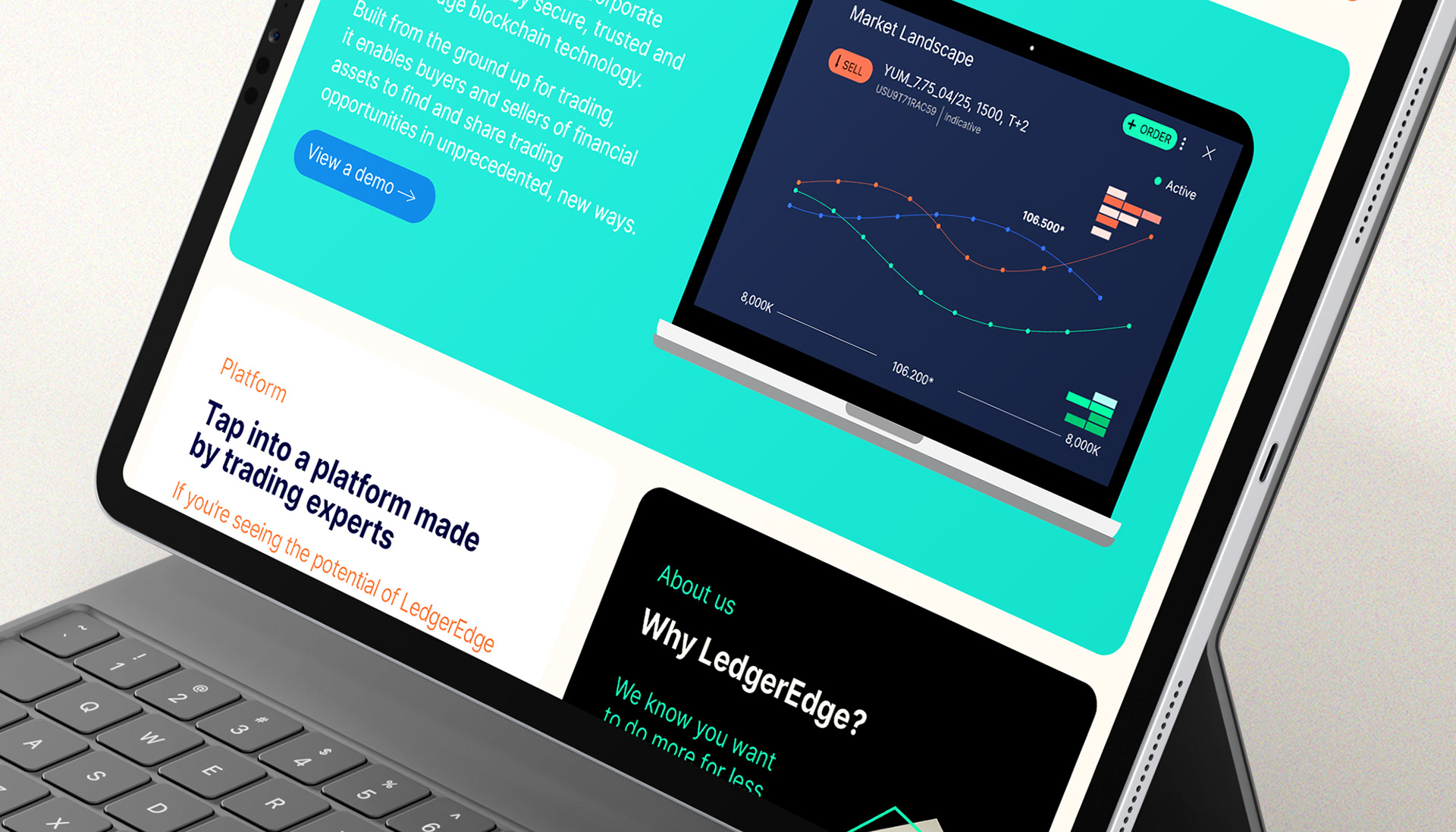
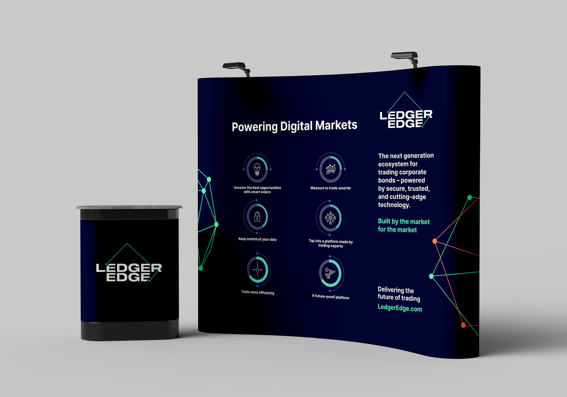
LedgerEdge is the next-generation ecosystem for trading corporate bonds – powered by secure, trusted, and cutting-edge technology. I was approached prior to the company's platform launch as they didn't feel that the existing brand look portrayed them as the cutting-edge fintech company that they are.
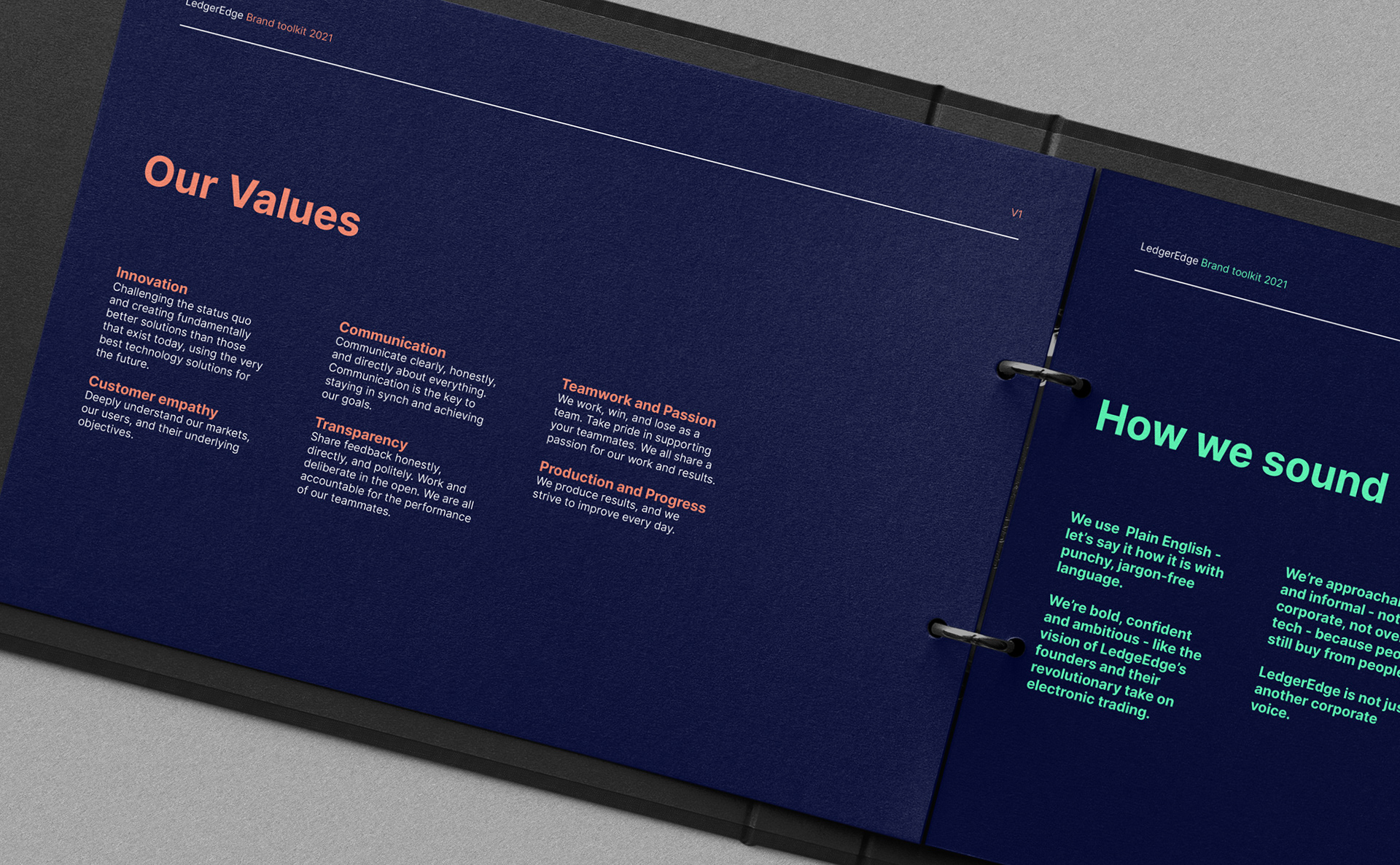
After a discovery session, it was apparent what LedgerEdge needed was a bold, digital-first brand with some straight-talking positioning demonstrating confidence and knowledge.
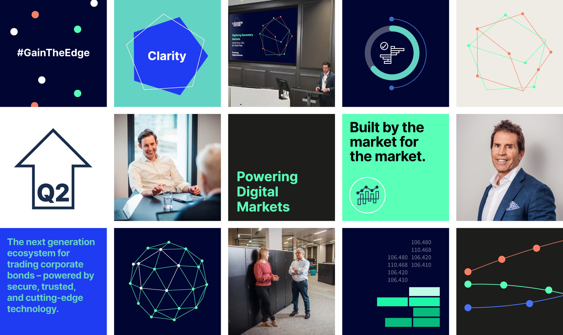
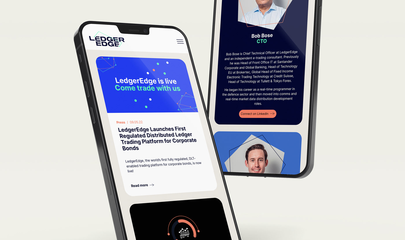
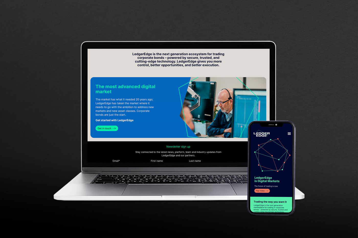
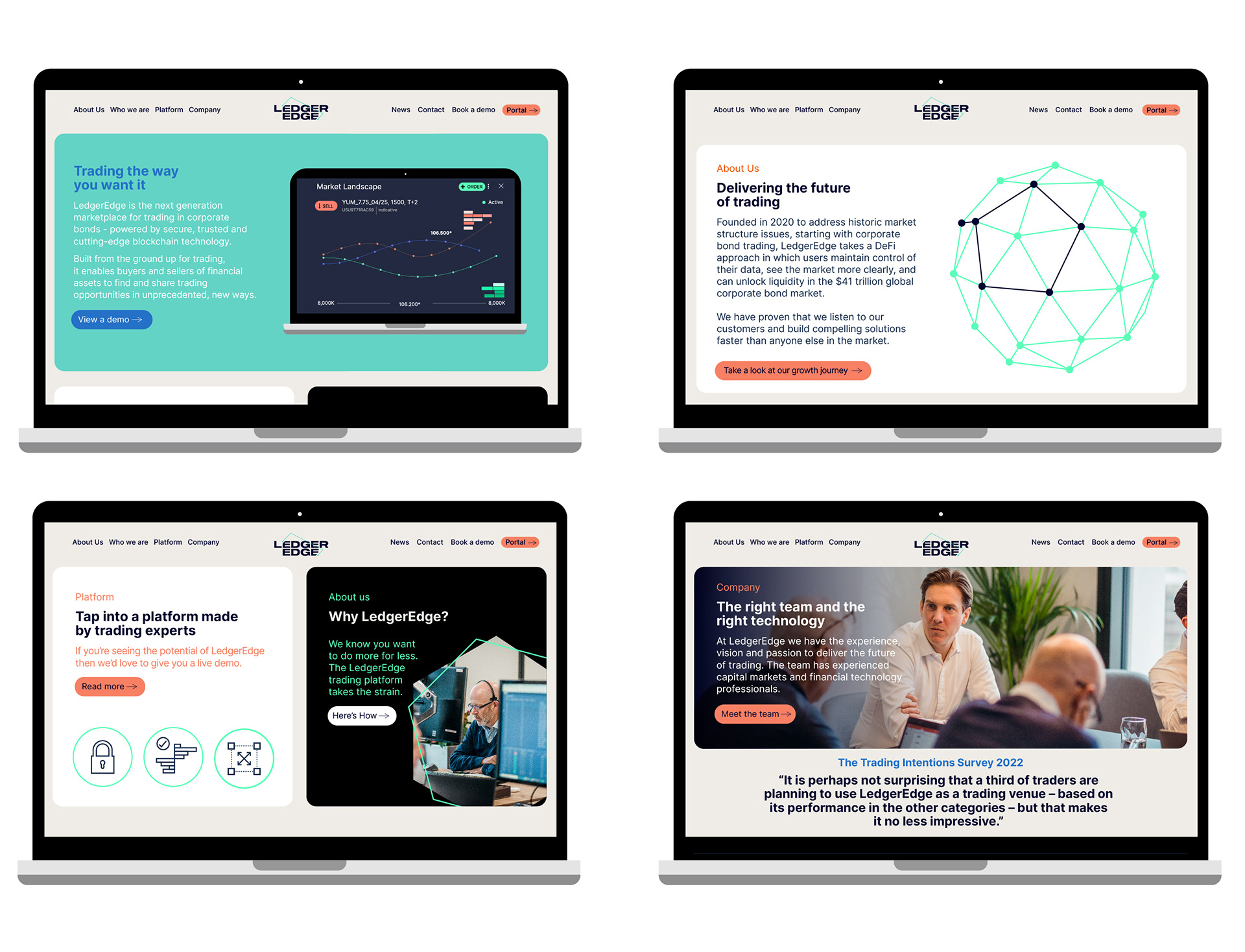
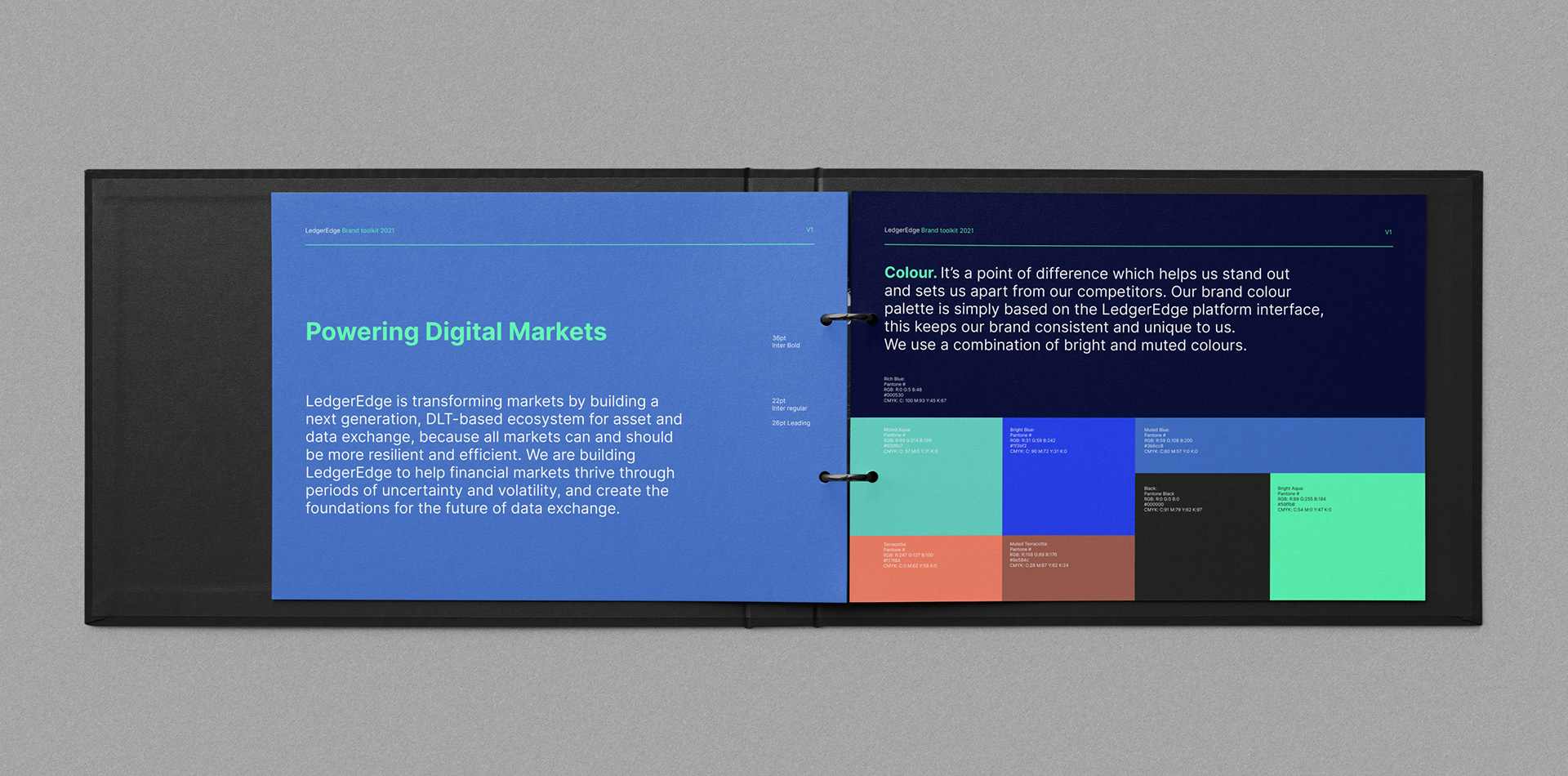
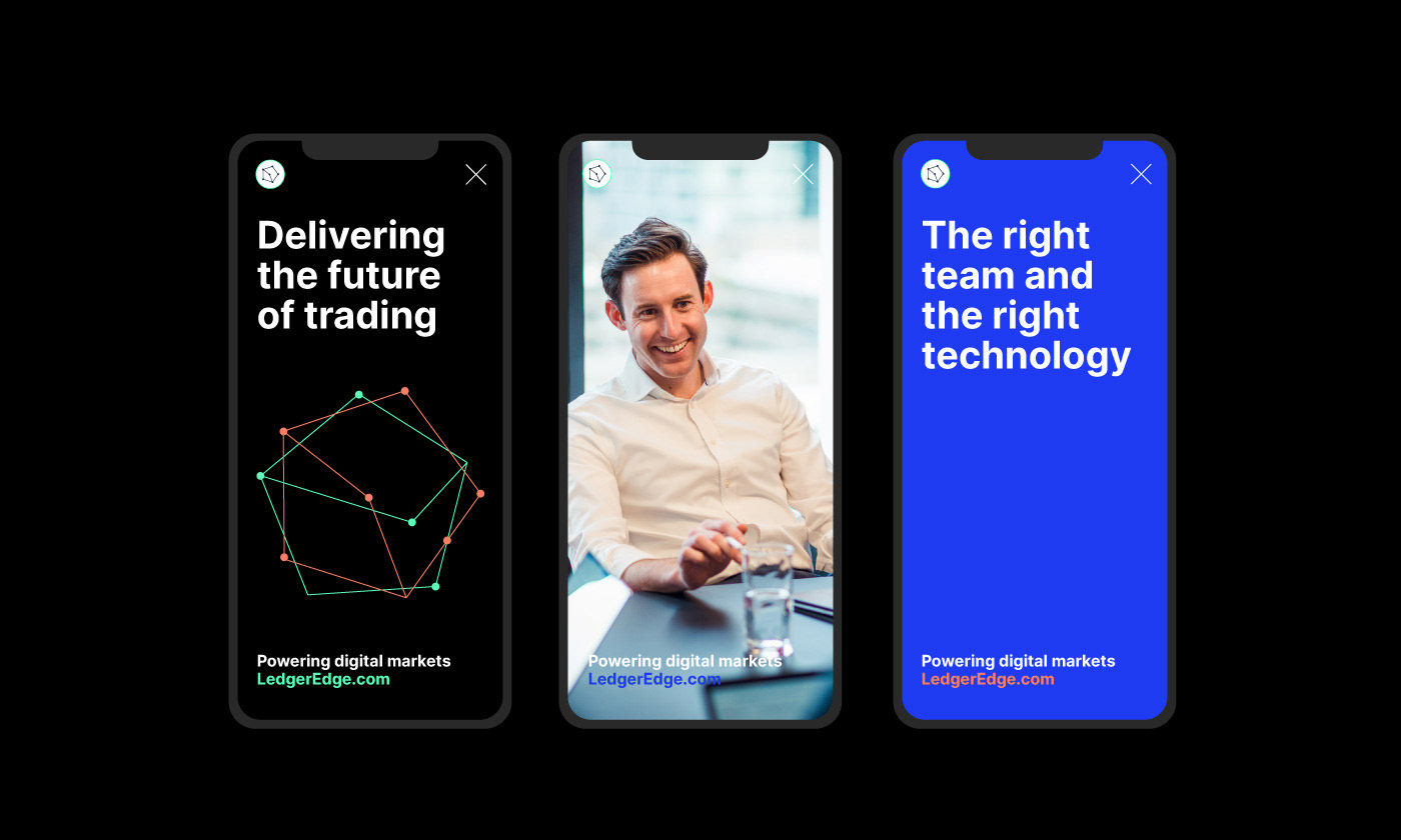
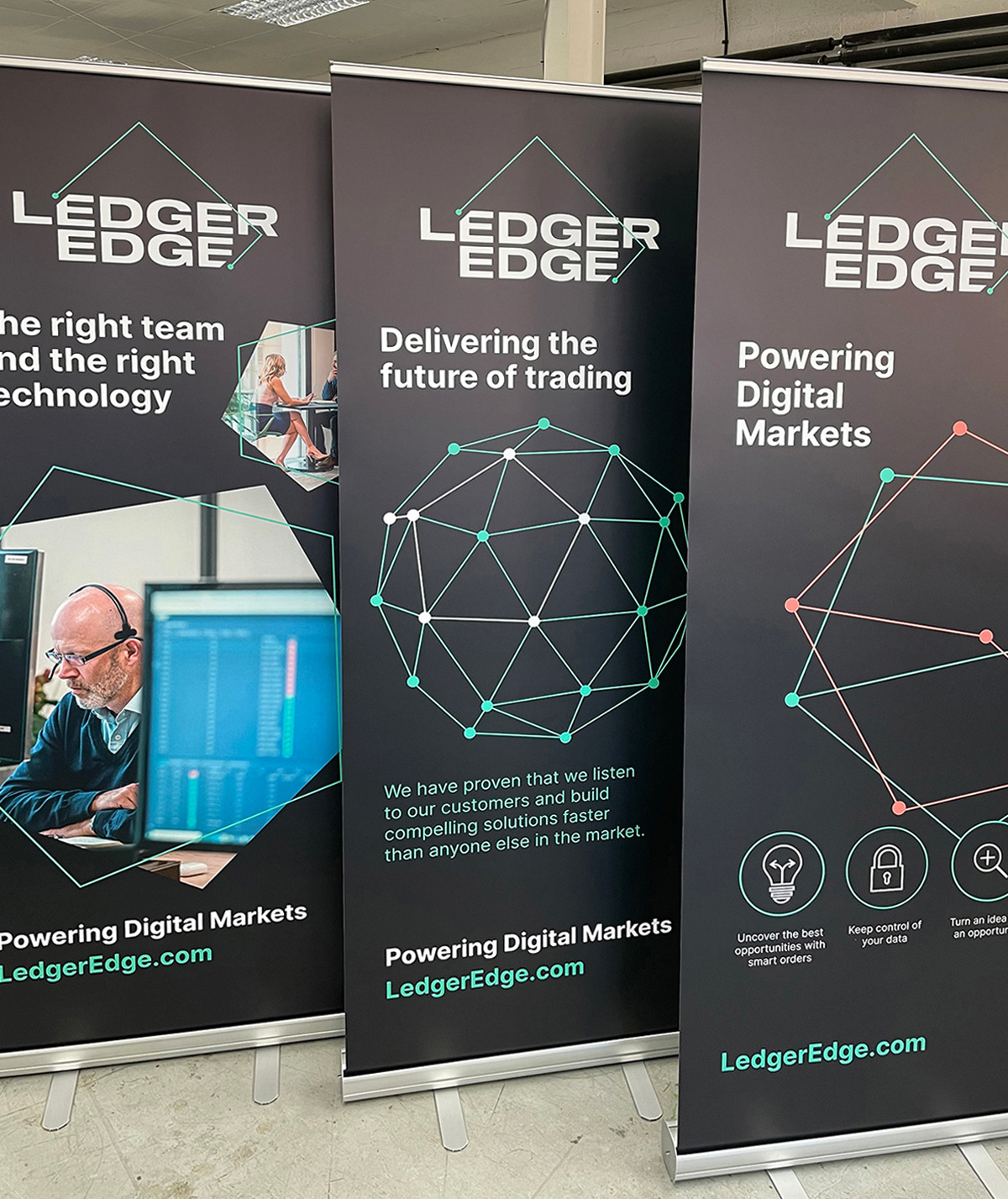
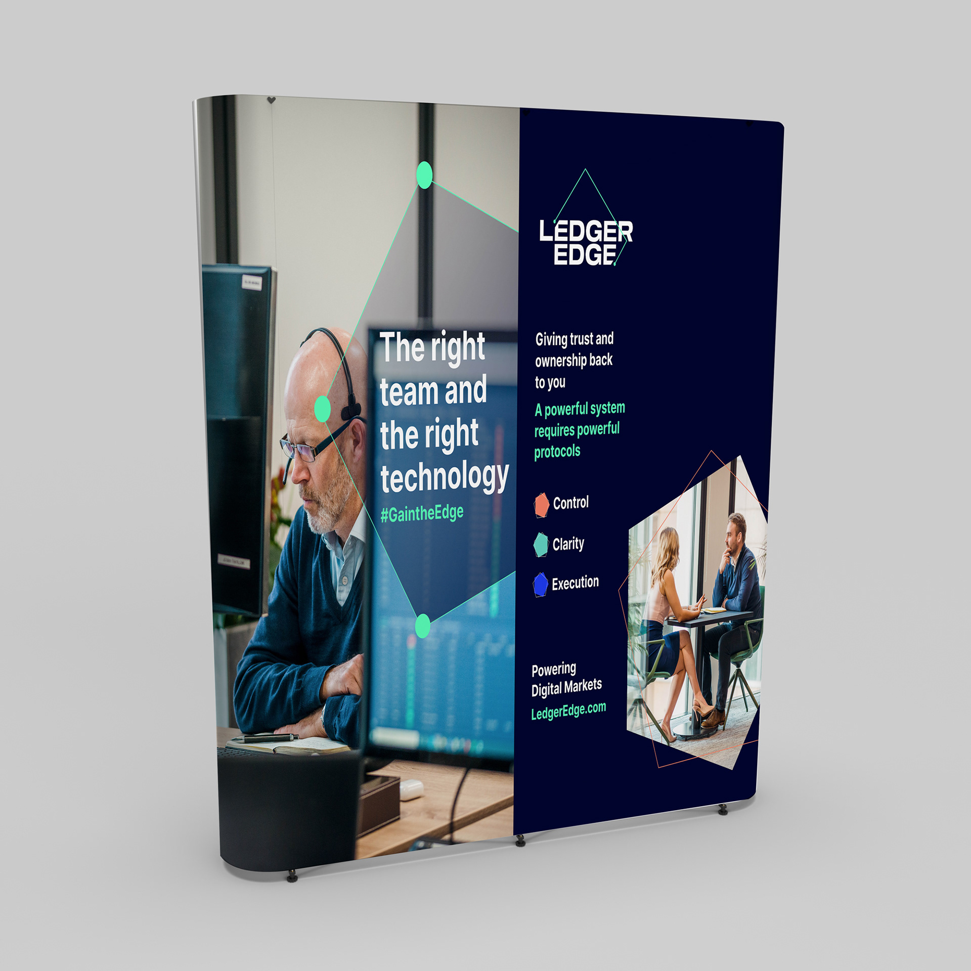
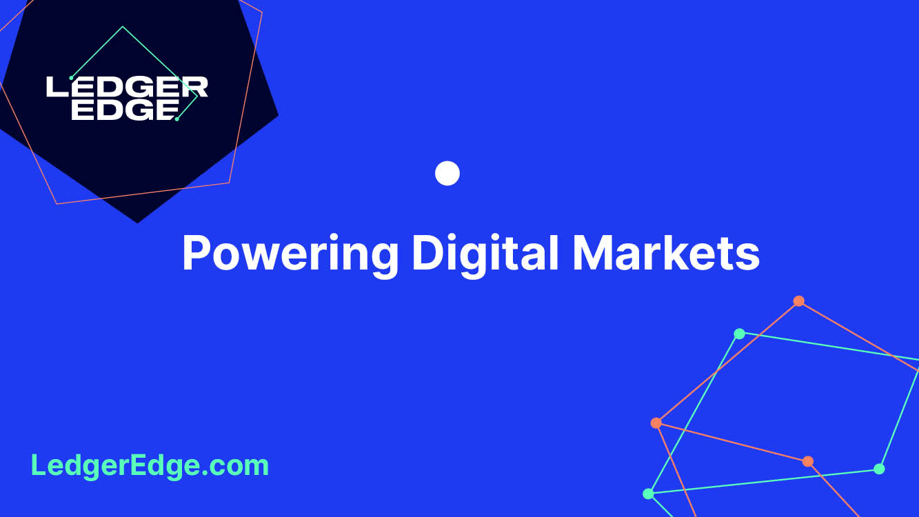
Moving away from existing conventional cyber stock imagery, a simplistic 2D graphic approach was introduced, aligning the organisation with more pioneering, forward-thinking technology corporations. A bold colour palette was adopted taking inspiration from the platform itself creating cohesion between the brand and the product.
The logo was relatively new so it was decided that a refresh was necessary but working within the constraints
of the existing logotype.
The logo was relatively new so it was decided that a refresh was necessary but working within the constraints
of the existing logotype.
Once the chosen route was agreed on, and alongside Katy, the LedgerEdge Marketing Manager, the project
was managed from initial concept to roll-out and delivery of all materials.
was managed from initial concept to roll-out and delivery of all materials.
Bringing together a complete brand overhaul, AiA collaborated with trusted creatives for copywriting, photography, website development and animation.
Project deliverables: brand language, tone of voice, and positioning, brand toolkit, business papers, social media assets, exhibition stands, t-shirts, website, animations, PowerPoint presentations and photography.